AI Can Build Your Personal Website Within Minutes. What’s More Important?
How to go from AI scaffolding to a personal site that actually reflects you.
AI website builders such as Lovable, Bolt, Replit, and v0 can turn one prompt into a personal website in under 10 minutes. I tested the same brief on all four, then took the strongest starting point into Cursor. This guide shows what the first prompt produced, what every tool invented, and the changes that made the site sound and work like mine.

For a while, I thought my Substack could serve as my entire online identity.
Then people started asking me the same questions:
“What apps have you built?”
“What’s that 30‑Project AI Challenge you’re doing?”
“Can we set up a quick chat?”
Every answer sent me looking for a different link. Some projects were buried in old newsletters. Others lived in a Substack sidebar that made sense to me because I already knew where everything was.
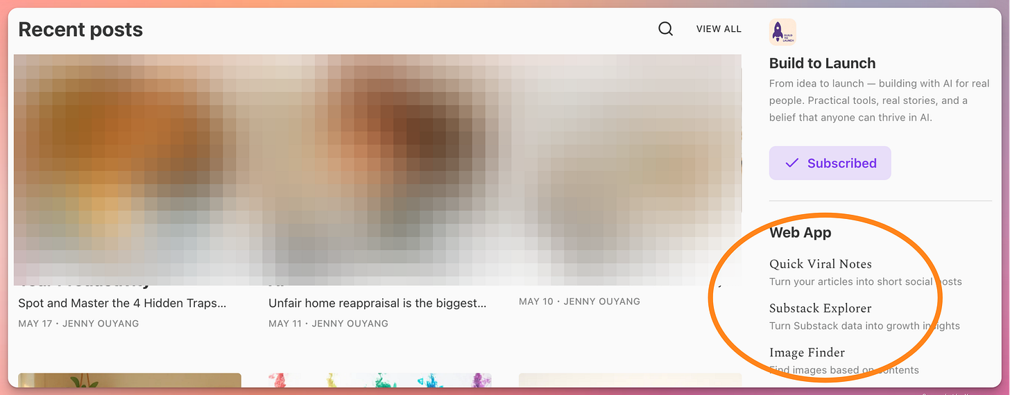
Maybe I’m the only one who can find the app list on my Substack page without looking twice
I needed one page that could answer those questions in 10 seconds: who I am, what I have built, and how to reach me.
So I wrote myself a challenge:
"Ship a personal site that tells my story in 10 seconds."

How I Built 4 Personal Websites From 1 Prompt
One prompt gave me four usable starting points in under 10 minutes.
I've done that. It's still mind-blowing to see a simple app built within minutes.
I had already used vibe coding tools for quick proofs of concept, so I followed the same 3-step routine:
Feed raw requirements into AI to refine and roast the idea.
Ask AI to generate one high-signal prompt for the builder.
Paste that prompt into the builder and compare the result against the brief.
Why one-prompt works well:
Every tool receives the same requirements.
The first output reveals each tool’s design defaults.
I can choose a starting point before spending time on revisions.
I asked AI to turn my newsletter home page and requirements into one website brief. Then I ran it through Bolt, Replit, v0, and Lovable.
Less than 10 minutes later, I had four home pages to compare:

The home pages Bolt, Replit, v0, and Lovable produced from the same prompt.
My first reaction to each one:
Bolt: Flashy, dynamic, a bit too much for me.
Replit: Bland. Also, thanks for making up that image of me…
v0: Modern, simple, neutral.
Lovable: My top pick, clean, slightly styled and closer to my tone.
The same prompt exposed each tool’s defaults. That made the comparison useful before I touched the code.
Products page
I specifically wanted a products page to answer the "what have you built?" question.
Turns out, each tool had its own mind. Based on my Substack content, they invented toolkits, courses, and even products I hadn’t launched yet.
Surprise winner? v0.
While others threw generic ideas, v0 offered products that actually aligned with my real plans (before me).

Products page made up by Bolt

Products page made up by Replit

Products page made up by v0
What they all did well:
Followed the page structure in my prompt.
Generated plausible offers from themes in my writing.
Produced something polished enough to react to.
What they all missed:
Which products already existed.
Which services I could deliver.
Which ideas I wanted to keep as ideas.
But for a prototype? Worth every minute.
For a prototype, that was useful. For a public website, those guesses had to go.
This is the exact prompt I used. The output will vary across tools and can change between two runs on the same tool.
I want to build a personal website that showcases my work and offerings.
Here’s my blog: https://jennyouyang.substack.com – you can use it to understand my tone, personality, and content.

The site should include:

Homepage – A warm intro about me, what I do, and what I care about.

Blog – Embed or link to my Substack blog, styled to match the site’s look.

Products – A section where I can showcase tools, apps, or content I’ve built.

Services – A clear outline of services I offer (consulting, 1:1 sessions, courses, etc.), with links to book or contact.

About Me – A short bio that blends professional background with personal voice, in line with my Substack tone.

Contact – A simple form or email link for potential collaborators or clients to reach me.

Design should be clean, friendly, and easy to update.
Feel free to use my writing style and themes from the blog to guide the voice and visuals.
I later ran a stricter same-brief test across Claude Code and 7 other AI coding tools. The pages looked close at first. The browser and code audits exposed much larger differences.

What the AI Website Builders Left Unfinished
The generated pages gave me a layout. The real website still needed content, integrations, and decisions.
The first version looked clean, but it barely answered my three original questions:
Who am I?
What have I built?
How can someone reach me?
I still needed to replace the invented content, add contact details, connect a mini-course sequence in Kit, set up authentication, and buy a domain.
On top of that, I hit the technical work the first prompt had hidden:
Substack integration: Pulling recent posts into the site required more work than generating a static blog section.
Prompt limits: As the site grew, requirements started competing for space and attention.
Generic copy: The generated writing sounded professional and could have belonged to anyone.
External services: Email, analytics, authentication, and forms each needed their own setup.
The first prompt produced a front end I could evaluate. Shipping it required another pass through the content, integrations, and technical setup.
The workflow I kept
I exported the generated code to GitHub and continued the build in Cursor.
That split made the work easier to reason about. AI handled repeatable implementation. I made the decisions that depended on my work, offers, and voice.
AI handled:
Layout and responsive behavior
Component scaffolding
Backend boilerplate
I decided:
The value proposition
The About page narrative
Which products and services belonged on the site
How the data and integrations should connect
We worked through together:
Contact forms
Project galleries
Email sequences
For example, I could describe a contact flow in Cursor, let it suggest the implementation, and then test whether the result matched how I wanted someone to reach me.
That division turned the generated page into a site I could keep changing without starting over.

4 Changes That Made the Personal Website Mine
Four changes moved the Lovable version from a plausible template to a useful record of my work.
1\. A real app gallery
I replaced the invented products with a visual gallery of apps I had shipped. Each item gave someone a direct path to the project instead of asking them to search through old newsletters.
The gallery also gave me a reason to keep the site current. Every finished project had somewhere to go.
2\. The 30-Project sequence
For the AI Challenge, I added a horizontal timeline. Each thumbnail linked to its case study, so the sequence read as one body of work rather than a collection of unrelated posts.
3\. A chatbot for finding past work
I also planned a RAG chatbot that could search everything I had published on Substack.
Someone could ask, “What’s Jenny’s experience with AI product launches?” and get an answer drawn from the relevant articles.
4\. Contact options I could support
The generated service ideas looked convincing. I liked several of them.

The tempting offer generated by AI
Could I offer them? Probably.
Did I have the time and energy to deliver all of them? No.
Did I want to? I was still figuring that out.
I removed the Services tab and created three ways to start a conversation:
High-commitment: “Book a 15-minute discovery call”
Medium-commitment: “Subscribe for weekly insights”
Low-commitment: “Ask a quick question via email”
Those options matched what I could support at the time. They also gave someone a choice based on how ready they were to talk.
After those changes, the first version of my personal website went live. The current site is at jennyouyang.ai.
The page was small. Building it settled four open decisions.

What Building the Website Forced Me to Decide
The website turned vague plans into decisions I could see on one page.
I had to decide:
Which products were real enough to show
Which offers I wanted to deliver
What a stranger should understand about my work in 10 seconds
How much maintenance I was willing to take on
The AI-generated versions gave me something concrete to accept, reject, or rewrite. That was more useful than planning the site in a blank document.
The first version also reminded me that my Substack About page needed an update. Once I saw the two pages side by side, the gap was obvious.
If you are still deciding whether you need a personal website, build the smallest version first. You can make better decisions once the choices are visible.
How to Build the First Version in 10 Minutes
You can produce a first version in 10 minutes and use it to decide what belongs on the real site.
Paste your Substack (or blog) link into ChatGPT.
Tell it you want to build a personal website and ask it to generate a one-shot prompt for Lovable.
Copy the prompt into Lovable, Bolt, v0, Replit, or Cursor. Run the same prompt through more than one if you want to compare their defaults.
Let the POC render.
Mark what is accurate, invented, missing, and unnecessary.
The generated page is the starting point. Before you publish it, replace every invented claim and decide which contact options you can support.
My production-ready vibe coding guide covers the testing and cleanup that come next.
If you build the first version, share it here. I’d love to see what the prompt got right and what you changed :)
— Jenny